
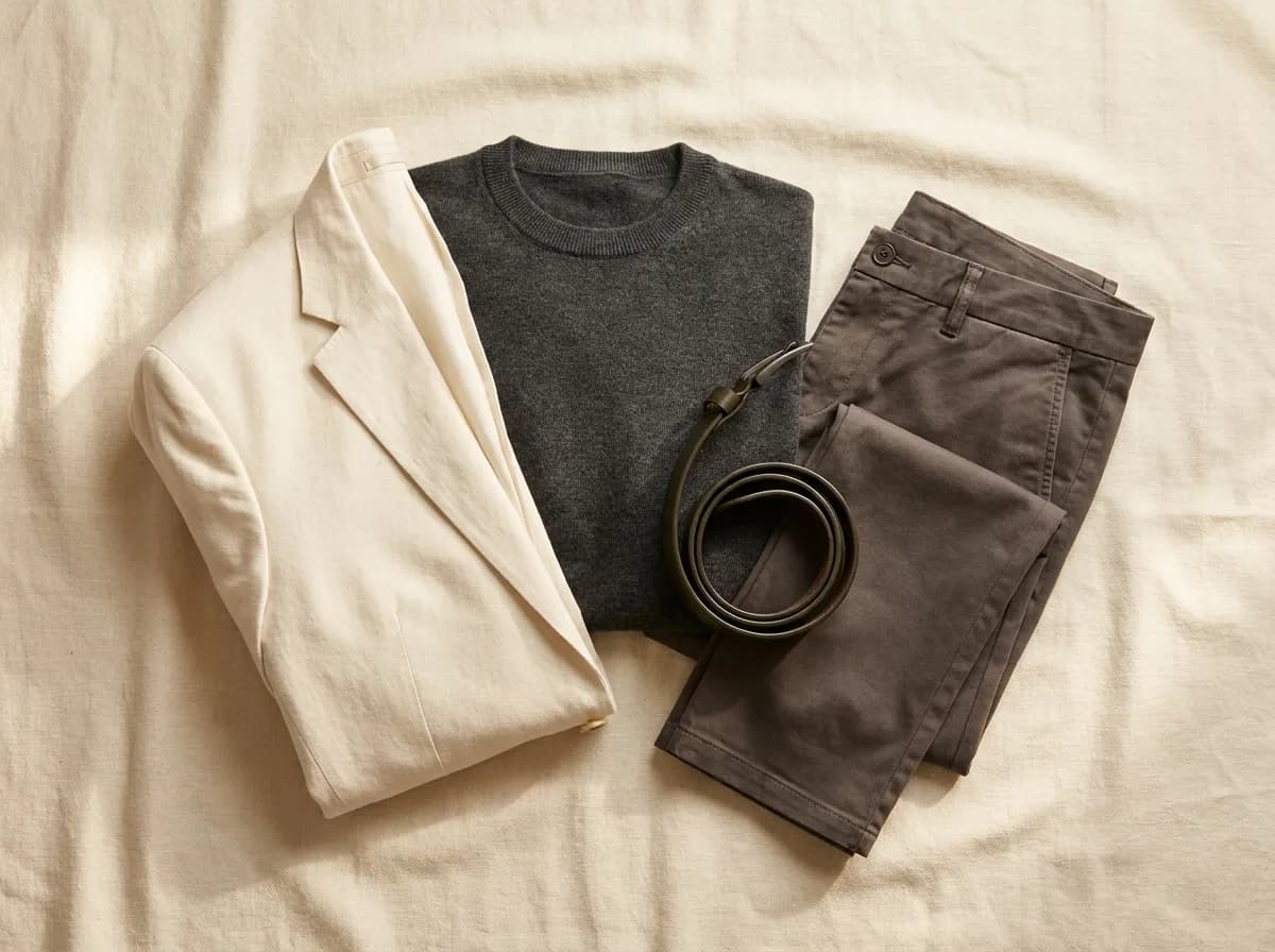
'Just wear navy and grey' is the most common style advice given to men. It's not wrong exactly - navy and grey are genuinely versatile - but it's only half the answer. The other half is: which navy? Which grey?
Every neutral exists on a spectrum from warm to cool. Charcoal (cool) and chocolate (warm) are both dark. Icy white (cool) and cream (warm) are both light. True navy (cool) and petrol navy (warm) are both blue. The distinction matters enormously, and it's the distinction most men have never been told about.
Undertone is the variable most men miss
Your skin has an undertone - a secondary cast beneath the surface color. It falls into three rough categories: warm (golden, peachy, or olive tints), cool (pink, red, or bluish tints), and neutral (a balance of both).
To identify yours roughly: look at the veins on the inside of your wrist. Greenish veins suggest a warm undertone. Bluish or purple veins suggest cool. A mix of both suggests neutral.
Another test: how does your skin look in direct sunlight? If you tan easily and go golden, you're likely warm. If you burn first or turn pink, likely cool. If it's somewhere between, neutral.
This isn't about your surface skin tone - whether you're light, medium, or deep. It's about the temperature of the undertone beneath it. Two men with identical surface coloring can have opposite undertones and look best in completely different palettes.
Warm undertone: your neutrals
If you have a warm undertone, the neutrals that will serve you best are those with a yellow, orange, or earthy base:
Camel and warm tan are among the strongest options - rich, well-suited to your complexion, and extremely versatile with denim and mid-tones. Warm taupe (a greyish-beige with a warm lean) works as a cooler-weather neutral. Olive and khaki work for warm coloring in a way that cool greens don't.
Rust and burnt orange read as statement colors but are actually neutrals for warm-season men - they sit naturally against warm skin rather than fighting it. Chocolate brown (not espresso-cool, but a warm amber-brown) is one of the most underused warm-season neutrals.
The grey and navy to reach for: warm mid-grey (has a slight beige lean, not blue-grey) and a darker petrol navy rather than a stark primary navy.
Your wardrobe can feel sharper.
Know your exact colors. Stop guessing what works.
Cool undertone: your neutrals
Cool-undertone men look best in neutrals with a blue, pink, or grey base:
Charcoal is one of the best neutrals in existence for cool coloring - it sharpens contrast without the harshness of black. True navy (a clear, primary navy without warm undertones) is the other pillar. Slate grey - the blue-grey that feels almost cold - is exceptionally good for cool-undertone men and underused.
For lighter neutrals: soft white or cool white (not cream, not ivory - those have yellow in them that fights cool undertones). Light grey is a reliable base for cool coloring across seasons.
The neutrals to be careful with: camel, warm taupe, and brown in general can create a washed-out effect against cool undertones. They're not forbidden, but they need the right supporting colors to avoid looking flat.
The neutral that works for everyone (and one that doesn't)
Mid-grey is the closest thing to a universal neutral. Not charcoal (too cool-leaning), not warm grey (too warm-leaning) - a true medium grey sits near-neutral on the temperature spectrum and generally suits most undertones well. If you're unsure of your undertone, mid-grey is the safest starting point.
Pure black is harder than most men assume. It looks crisp in photos but next to the face it creates high contrast that can emphasize shadows and asymmetry. Men with high natural contrast (dark hair, light skin) can carry it well. For lower-contrast coloring, charcoal or a deep navy will almost always work better for your complexion.
The takeaway isn't a rule to memorize - it's a reference to use. Once you know your undertone, look at the neutrals already in your wardrobe through that lens. The pieces that photograph badly, that never quite look right, that feel like they should work but don't - you'll often find they're the ones sitting on the wrong side of the warm-cool divide.
Your palette is a diagnostic tool. Use it that way.